
Unveiled today was the Duchess of Cambridge Kate Middleton’s portrait painting, commissioned by the National Portrait gallery and painted by Paul Emsley. This beautiful painting sparking controversy already in the media and in the public. With such comments as “It makes Kate look old”, “It adds 10-20 years onto her”, “It is depressing” and “She looks better in real life” These are the more nicer of the negative comments…
So why am I writing about this painting, and what has it to do with me or photography. Well if you look at the images below you will notice first of all it is a “photograph” of the painting. The second obvious fact is the white balance on all three photo examples below are different, not to mention the contrast as a third point. The high contrast adding age and drama. The colour temperature range from cold to warm, changes the mood of the painted image photo completely and the emotions one feels when looking at the “Photo” of a painting. This is not to say allegedly that some the media outlets may alter the contrast or tone, in order to create extreme public interest and opinions to make money…
Look at the examples below and see how the mood of the painting varies from colour temperature.
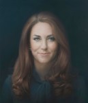


The photo of Paul Emsley in front of the Kate painting, for me looks to more natural in skin tones and white balance.
I have not in any way, altered any of the photos above
At the end of the day, you need to see the real painting to form your honest opinion and not a photograph that has either too much contrast or the wrong colour tone.
